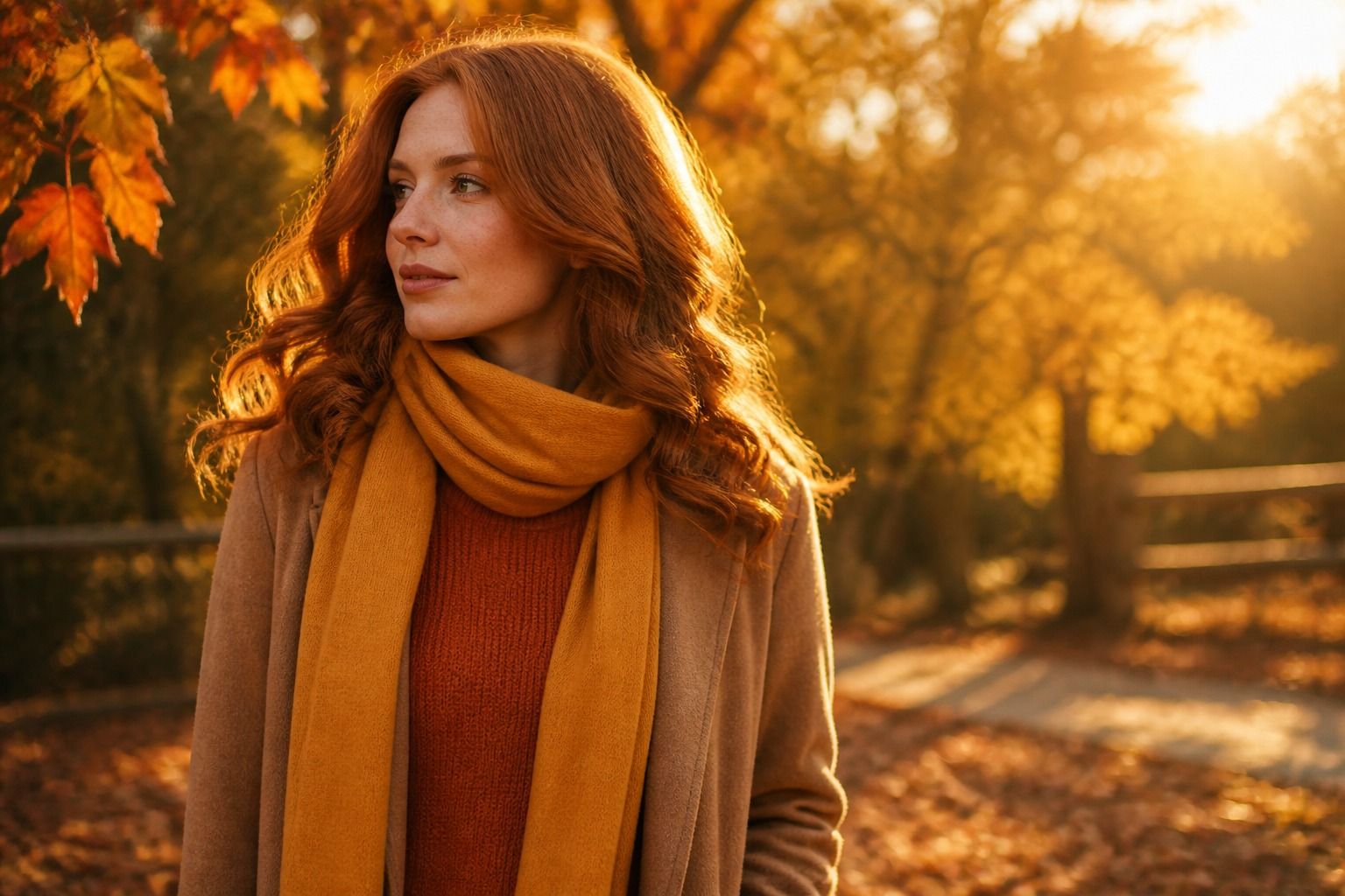
Warm autumn is the season people usually discover by elimination. You know you suit browns, but half the browns in stores leave you looking dusty. You know you are warm, yet orange makes you think of traffic cones. The missing variable is almost always clarity: warm autumn needs earth tones with heat and presence, not the muted, grayed versions that flatter soft autumn. Once you see the difference, the palette stops being a list of shades and becomes a way to walk into a shop and know within seconds which rack will work.
What Warm Autumn Looks Like in Practice
Warm autumn coloring starts with a golden undertone. Hair tends to fall in the warm browns: chestnut, copper, caramel, or a golden blonde with real shine, and if it has been dyed, the warm base still reads through. Skin can be light, medium, or deeper, and olive skin turns up here more often than people expect; the olive in warm autumn carries yellow, not gray. Eyes are amber, hazel, warm brown, or green with gold flecks around the pupil, and the overall contrast between hair, skin, and eyes is medium, not striking.
The Core Warm Neutrals That Carry a Wardrobe
Here is the test I use first. Hold a plain gold earring against one side of your face and a silver one against the other, in daylight, no makeup. If gold makes your skin look clearer and silver turns it slightly sallow, the warm path is open. Then go one step further: hold a rust scarf and a dusty mauve scarf together. Warm autumns almost always look healthier next to rust.
The neighboring seasons create most of the confusion. Deep autumn has the same warmth but higher contrast and darker depth, so espresso browns and blackened greens work there but feel heavy on a true warm autumn. Soft autumn shares the earthiness but removes the heat, which is exactly why its taupe and sage can drain a warm autumn. If you borrow from either family, take the warm end of it: a deep autumn chocolate is fine, but not a deep autumn maroon, which pulls purple and cools the whole face.
Warm autumn neutrals all carry a golden undertone, and that is the whole rule. Camel, golden brown, olive, warm khaki, and a beige that leans tan rather than pink form the working base. A capsule built from them is genuinely easy: camel trousers with an olive jacket, a golden brown knit over warm beige, khaki with rust accents. Nothing matches perfectly on purpose, but everything sits in the same warm family, so it all looks deliberate.
Watch for the neutral trap. A taupe that looks fine on the hanger can be gray enough to deaden the face, and many nude and greige colors in fast fashion are mixed with blue. Hold the fabric against your cheek: if it makes your skin look cooler or your jawline less defined, it is not the right neutral, no matter how much you like the cut.
For daily planning, the table below shows how the neutral sets differ across the three autumn neighbors, because that comparison is usually what decides whether someone lands in warm autumn or keeps sliding into a neighbor:
| Neutral | Warm autumn | Soft autumn | Deep autumn |
|---|---|---|---|
| Beige | Tan, golden sand | Greige, oatmeal | Warm espresso |
| Brown | Camel, golden brown | Mocha, dusty brown | Chocolate, cocoa |
| Green | Olive, khaki | Sage, moss | Forest, pine |
| Gray option | Warm greige | True mushroom | Charcoal with warmth |
If the warm autumn column looks obviously more golden to you, trust that instinct; it is the whole point.
Red, Orange, and Yellow Done Right
These are the colors people get wrong in two opposite directions: too loud or too brick-like. Warm autumn reds are terracotta, brick, paprika, and a tomato red with more orange than blue. Scarlet, raspberry, and any red with visible pink read cool and make warm skin look blotchy. When in doubt, compare a scarlet tee with a brick one; the difference near the face is instant.
Orange should feel like copper and rust rather than a safety cone. Rust works as a jacket, copper as a silk blouse, burnt orange as a sweater; the loud end of orange is better as an accent like a bag or scarf than as a whole outfit. Yellow behaves the same way: mustard and golden yellow flatter, while acid or lemon yellow fights the golden undertone and can turn the skin sallow.
One useful trick is to stop thinking of the palette as single shades and think in pairs. Rust plus olive, mustard plus camel, brick plus khaki: each pair gives the warmth somewhere to sit. A full rust outfit can feel costumey in daylight; rust with a warm neutral looks like a decision.
Makeup for Warm, Clear Earth Tones
Makeup follows the same logic as clothes, and the biggest single mistake is foundation with a pink undertone. Warm autumn skin reads clearer with a golden base; if your foundation makes your neck look pale and your face pink, it is probably cool. Blush should be terracotta, peach, or apricot, applied lightly; fuchsia and dusty rose blushes sit on warm skin like a sticker.
Lipstick is where warm autumn has the most fun. Brick, rust, terracotta, and a warm brick red all look intentional; a true warm autumn can also wear a clear golden orange lipstick in summer. The caveat: some brick lipsticks read brown, and on warm autumns with deeper skin that is fine, but on lighter warm autumns it can look like you smeared coffee. Test the same lipstick on your hand and your lips before buying.
Eyeshadow should stay in the bronze-to-olive range: copper, warm bronze, olive shimmer, golden brown. Gray-lavender shadows, which flatter cool seasons, will make warm autumn eyes look tired rather than defined. Brown mascara keeps the face cohesive; black mascara is often the first thing that makes a warm autumn outfit look off.
How to Test Warm Tones Near Your Face
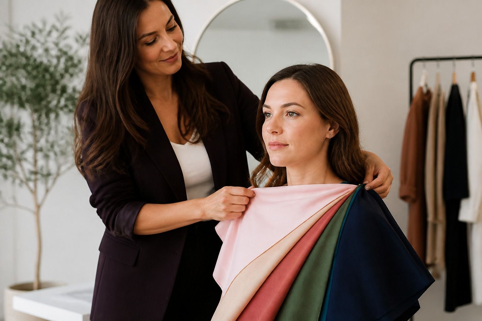
Do not test colors against your arm, and do not test in a bathroom. The arm reads lighter or darker than the face, and artificial light adds yellow that tricks you. Stand by a north-facing window or outside in shade, pull your hair back, and hold fabric against your bare neck and jaw, one color at a time.
Use three benchmark colors: camel, rust, and olive. If all three lift your face, warm autumn is the right frame. If rust is too strong but camel works, look at soft autumn. If you need darker versions to feel right, look at deep autumn. If olive makes you look sallow while golden brown works, check true spring, where the earth tones give way to brighter warm colors.
The last check is the most honest one. Take a photo with each color against a neutral background, in the same light, and compare the shadows under your eyes and around your nose. The color that reduces those shadows and adds color to your lips without blush is the color to trust. That evidence matters more than any palette chart, because it is your skin doing the deciding.