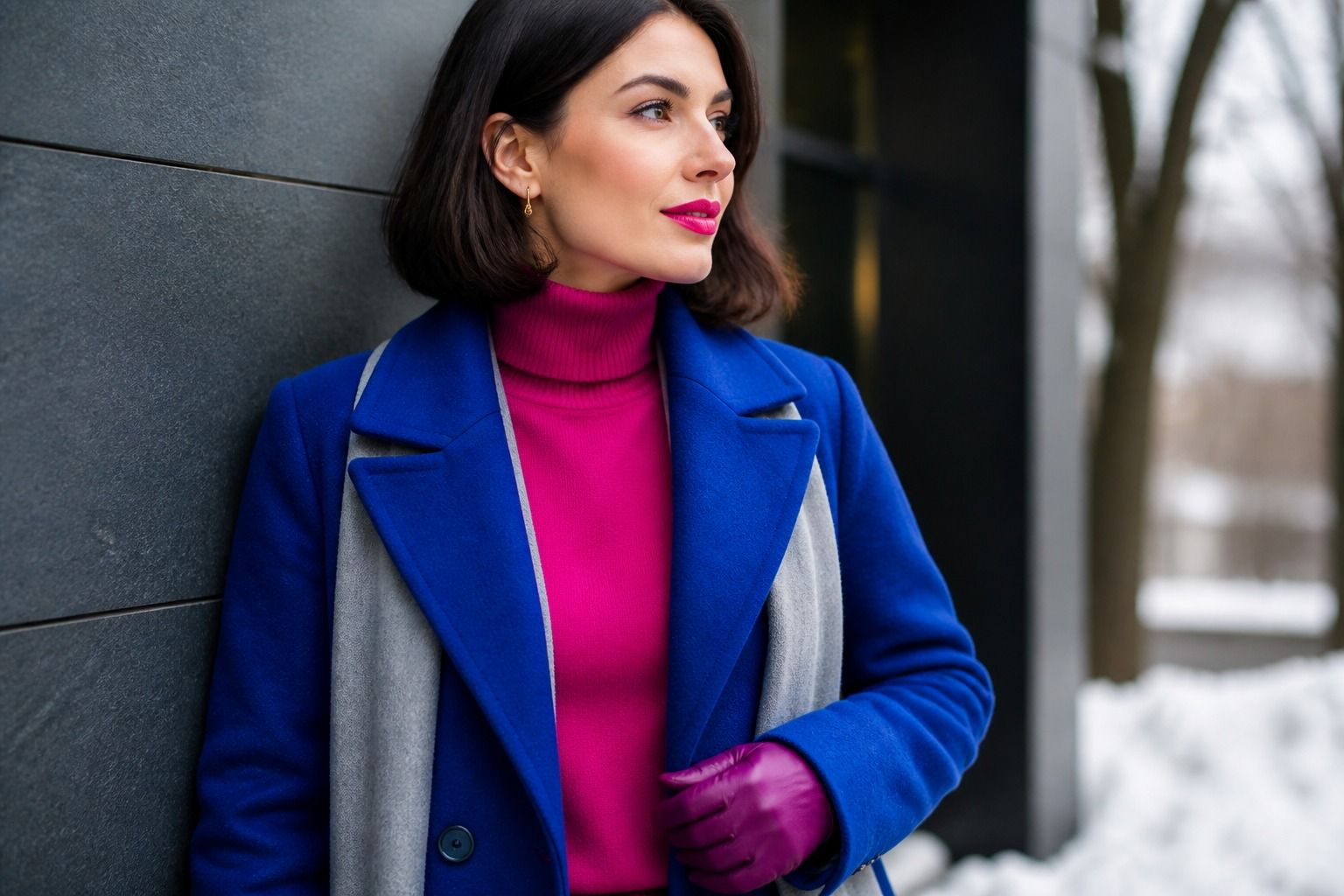
Most people who sit down with me holding a bright winter question already suspect the answer. They hold up fuchsia and something in them wakes up, then they second-guess it because the color feels loud. The bright winter color palette works precisely because it is loud in a controlled way: saturated, cool, clear tones matched to a face that already carries high contrast. This guide is really about two decisions: whether this palette is yours at all, and if it is, which intense shades will read as polished rather than costumey on an ordinary week.
The signature of bright winter
Bright winter sits at the intersection of a cool undertone and high contrast. Contrast, here, means the difference in depth between your hair, eyes, and skin. The classic reading is dark hair against lighter skin, but I have typed bright winters with medium brown hair and pale eyes; what mattered was that the gap between features stayed large and obvious from across a room.
Saturated colors that stay wearable
Do the squint test in front of a mirror with neutral daylight behind you. Squint slightly and check whether your features separate into clear zones: hair visibly darker than skin, eyes with a defined rim. If they do, you have contrast to work with. Then move to the undertone: do cool blues and pinks lift your face while warm terracotta sits slightly wrong on it? Cool plus contrast plus clarity is the whole signature. Notice that clarity matters as much as depth; this is not a palette of washed-out pastels, even though the colors are often described as icy.
One caveat before you get excited: high contrast alone does not make you bright winter. Deep winter also pairs cool undertones with contrast, but its colors run deeper and heavier, think burgundy and navy rather than electric blue. If muted dark shades flatter you more than saturated bright ones, you are probably closer to deep winter, and that is a genuinely useful thing to learn before you buy a bright pink coat that feels wrong on the first wearing.
The heart of the palette is a set of intense cool colors: fuchsia, electric blue, emerald, royal purple, and a clear true red. The word to hold onto is saturated, not neon. Neon reads fluorescent, and even a true bright winter can look like a warning sign in it. The palette works one notch below neon: the color is fully intense, no gray mixed in, but it still holds its hue in normal daylight instead of glowing.
Here is a test I run in actual shops. Take a fuchsia blouse and an electric blue tee to the natural light near the entrance and hold each under your chin, no makeup. If your face stays clear and your eyes look brighter, the intensity is right. If you notice the garment before you notice yourself, the shade is too loud, and a slightly deeper or softer version of the same hue will do more for you. Fabric changes the result too: the same electric blue reads completely different in matte cotton, glossy silk, and a textured knit, so judge the color on fabric that matches how you actually dress.
You do not need saturated color from head to toe. A fuchsia blouse with black trousers, an emerald dress at a wedding, an electric blue bag against a white shirt; each of these carries the signature without shouting. The one combination that fails is a single muted piece inside an otherwise bright outfit. The contrast drops, the look goes fuzzy, and everyone can tell something is off without being able to say what.
Pairing brightness with crisp neutrals
Bright winter neutrals are black, white, charcoal, and the occasional clear navy. The rule I keep coming back to is that the neutral must be as crisp as the color beside it. Black works because it echoes the depth in your hair or eyes. White works because it echoes the lightness in your skin. Put the two together, a white blouse under a black blazer, and you have a frame that makes any saturated accent look deliberate.
Color blocking looks like the hardest bright winter move and is actually the easiest. Because your features already separate cleanly, the eye reads two strong color blocks as structure rather than chaos. Fuchsia and white, emerald and black, electric blue and charcoal: each pairing does half the styling work for you. If the idea makes you nervous, start with one block, a colored top over neutral bottoms, and build up to two saturated panels once the first week feels natural.
The neutral to be careful with is cream. Warm creams and beiges sit on the wrong side of the undertone and quietly muddy a bright winter outfit. If a garment looks almost white in the store, hold it next to pure white and then next to your face; if your skin loses its glow against it, leave it on the rack. Navy is a subtler risk. A clear, saturated navy works beautifully, but a grayed-out navy drags the whole look toward deep winter and dulls the brightness you are trying to protect.
Makeup and lip color for clear contrast
Lipstick is the fastest bright winter test and the easiest daily win. A blue-based red or a raspberry fuchsia should look natural on you, which surprises most people the first time they try it. I have watched women apologize for wearing a red that actually looked better than their own lips. The reverse check is just as informative: if a muted brown or terracotta lip makes your face look older and the color seems to float on top of you, that is your undertone talking, not your personal taste.
The rest of the makeup follows the same logic. Blush in cool pink or a clear berry, placed lightly, echoes the natural flush that bright winters often have. Eyeshadow in cool gray, navy, or a soft silver flatters more than warm browns, which can make bright eyes look tired by the end of the day. Keep the finish clear rather than heavy; your features already supply the structure, so contour is a choice, not a requirement.
One practical detail that saves a lot of regret: check the lipstick in daylight before you commit to the day. Store lighting flatters any red, and what looked like a perfect fuchsia at the counter can read completely different by a window. A swipe on the back of your hand is not enough. Apply it, step outside, and see whether your skin still looks alive next to it. Thirty seconds of daylight beats a month of wondering.
Reading a color for clarity before you buy
Since clarity is the quality that separates bright winter from every other cool season, learn to read it in the store. Three quick questions. First, is there gray in it? A clear color has no visible gray; a muted one does, and if you cannot tell, compare the garment to a known clear color like a red tomato or a blue sky. Second, does the hue hold in daylight? Move the fabric from the fluorescent aisle to the window and watch whether it keeps its character. Third, does it glow or shout? Glowing is right; shouting is neon, and it will compete with your face even when the color is technically yours.
These same three questions work for small doses, which is how most bright winters actually live with the palette. An electric blue phone case, a fuchsia scarf, a red handbag, even nail polish in a clear cool red: the small touches keep the brightness without demanding a full outfit. When I work with clients who are afraid of the palette, we almost always start here, one accessory per week, and let the compliments do the convincing.
Bright winter vs true spring
The confusion between bright winter and true spring is the most common misdiagnosis I see, and it makes sense: both seasons love clear, intense color and both can carry contrast. The difference is the undertone underneath. Hold fuchsia in one hand and coral in the other, near your face, no makeup, in daylight. If the coral makes you look slightly sallow and the fuchsia clears your skin, you are on the winter side. If the coral warms you up and the fuchsia makes you look pale, spring is the more honest answer.
| Check | Bright winter | True spring |
|---|---|---|
| Undertone | Cool, blue and pink | Warm, gold and peach |
| Contrast | High and crisp | Medium to high |
| Best test colors | Fuchsia, electric blue | Coral, tomato red, turquoise |
| Flattering lipstick | Blue-red, raspberry | Coral-red, warm orange-red |
| What drains you | Muddy warm neutrals | Icy cool pastels |
Keep the test short. Thirty seconds with two fabrics tells you more than a week of reading descriptions, and it is the same check a consultant would run in person. If you land on bright winter, give the palette a real week: one fuchsia top, one electric blue piece, one crisp white shirt. Watch how often people comment on your face instead of your clothes. That is the entire point of the bright winter color palette, color that disappears into looking like you.