True spring is the palette for people who are warm, bright, and tired of being told they look like autumn. The stereotype that spring equals pastels and baby pink is wrong in a specific way: true spring colors are clear and sunny, saturated but never muddy, and their whole job is to keep the face looking fresh without shouting. If you have ever bought a bright coral top on a whim and gotten more compliments than from any neutral outfit, you already know what this palette can do.
How True Spring Differs from Light Spring
The two warm spring sisters get confused constantly, and the confusion usually happens because both can have light hair. Light spring is the softer, airier version: lower contrast, less saturation, colors like light peach, soft golden yellow, and pale warm green. True spring keeps the warmth but adds clarity and presence; its colors are coral, turquoise, golden yellow, and warm green at full strength, with enough pigment to hold their own in daylight.
The Bright Warm Core of the Palette
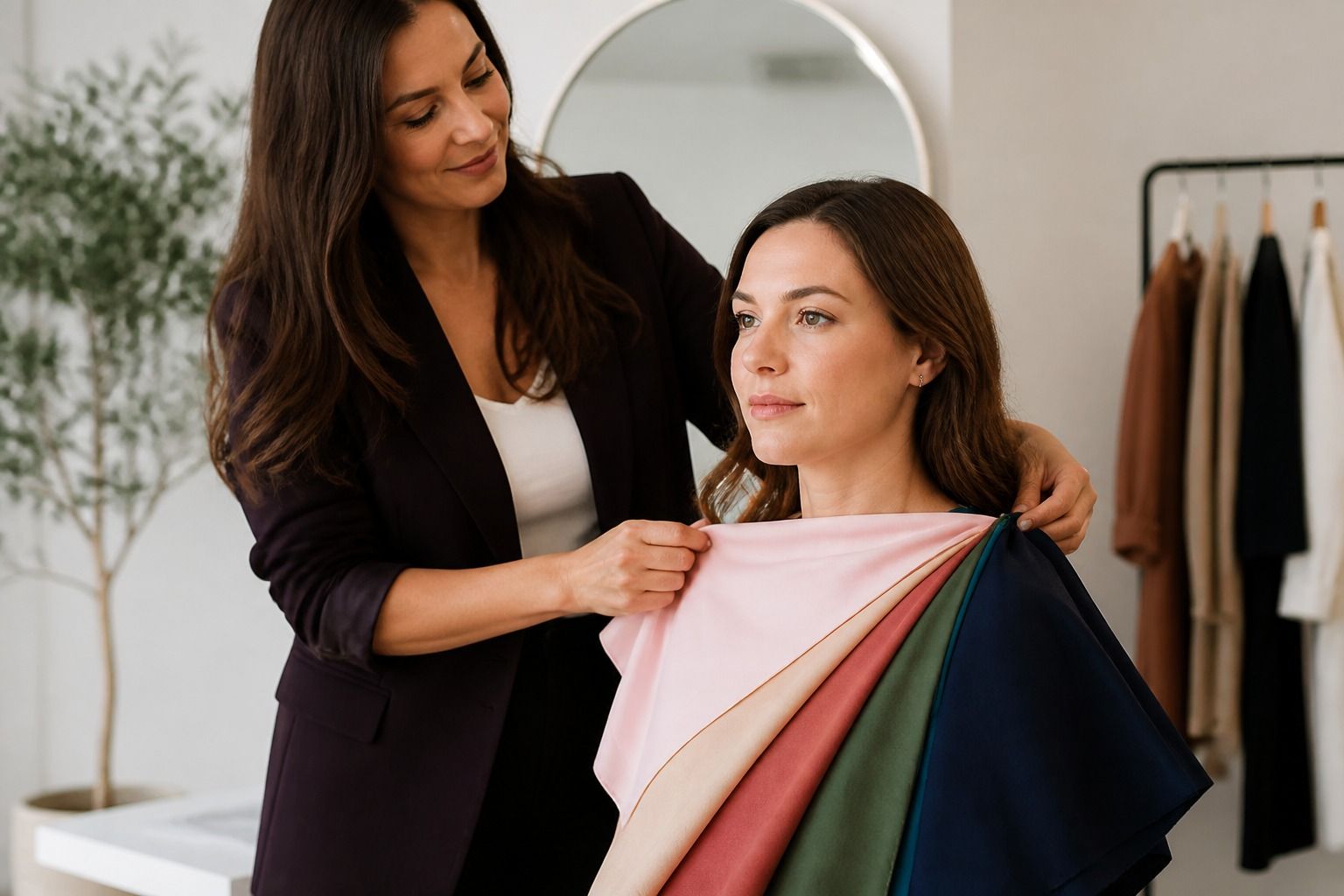
A practical way to separate them is the white test. Hold a pure white and a warm ivory next to your face. Light spring can usually wear both, preferring the ivory; true spring finds pure white harsh and wants the ivory even more, because white with blue in it pulls the blue out of your skin. If light peach makes you look soft but coral makes you look alive, the answer is true spring; if coral feels like too much costume, light spring is the safer frame.
There is a second, less obvious difference: what happens to brightness. Light spring stays gentle; true spring blooms. That is why true spring sometimes gets pushed toward warm autumn, especially by online quizzes that only ask about warm versus cool. Both are warm, yes, but warm autumn is earthy and muted, while true spring is clear and bright. The question that settles it is rust versus coral, and the honest answer usually shows up on the face.
The heart of true spring is a handful of colors that all share the same DNA: warmth plus clarity. Coral is the signature; turquoise is the second most useful; golden yellow, warm apple green, peach, and a tomato red with more orange than blue fill out the set. Each one works like a small dose of light near the face.
Some direction on the tricky pairs. Turquoise, not teal: teal reads cooler and muted, while true turquoise keeps the yellow undertone. Golden yellow, not mustard: mustard is an autumn color, grayed and earthy, and it dulls true spring skin. Warm green, not emerald: emerald has blue in it; apple green and grass green flatter better. And in red, tomato and coral-red beat cherry and raspberry every time.
The mistake is wearing all of them at once. True spring reads best with one bright color anchored by a warm neutral: a coral blouse with cream trousers, a turquoise knit with a camel skirt, golden yellow with warm gray. When every piece is bright, the face competes with the outfit and the freshness disappears.
Neutrals That Hold the Brightness
True spring neutrals have one assignment: support brightness without dulling it. Cream and warm ivory do most of the work; camel, warm gray with a golden hint (the greige family), light khaki, and chocolate brown act as anchors. Warm navy works as a softer alternative to black, which true spring should treat as a stranger: black next to the face drains the golden undertone and makes bright colors look cheap by contrast.
Here is the neutral comparison that usually settles the spring versus autumn question, since both seasons reach for the same beiges and browns:
| Neutral | True spring | Light spring | Warm autumn |
|---|---|---|---|
| Beige | Cream, warm ivory | Light oat, pale sand | Tan, golden sand |
| Brown | Chocolate, camel | Soft taupe | Golden brown, rust |
| Gray | Warm greige | Powder gray | Mushroom, warm charcoal |
| Blue stand-in | Warm navy, warm denim | Soft periwinkle | Olive green |
Read the top row and you see the whole difference: spring neutrals are light and clean, autumn neutrals are deeper and earthier. If your best white is cream and your best brown is light, you are on the spring side of the line.
Makeup for Fresh Warm Color
True spring makeup is about translucency. Foundation should be warm and golden but light in coverage; a heavy matte base absorbs the clarity that the palette depends on. Blush goes peach or coral, applied lightly; the powdered-mauve blushes that cool seasons love will sit on true spring skin like a gray patch.
Lipstick is the highest-impact decision. Coral, peach, warm red, and golden pink all work; the common mistake is a pink-nude lipstick with blue in it, which makes warm skin look sallow by the end of the day. If a lipstick looks like it could belong to a cool season, it probably does, and your face will tell you within an hour.
Eyeshadow stays warm and light: peach, warm gold, soft copper, or a hint of turquoise as a liner. Brown mascara and warm brown liner keep the look cohesive, and this is the rare palette where a soft turquoise eyeliner can look intentional rather than costumey. Skip gray and lavender shadows entirely; they are the fastest way to make a true spring look tired.
Testing Brightness Without Going Neon
There is a real line between bright and neon, and true spring lives on the right side of it. Neon reads as artificial light; true spring colors read as strong natural light. The practical test is simple: hold a coral and a fluorescent coral together. If the fluorescent one makes your skin look greener or your teeth look duller, that is the boundary, and it applies to every bright color in the palette.
Benchmark colors for the test: coral, turquoise, golden yellow, and warm green. If all four lift your face in daylight, true spring is your frame. If coral is too strong but peach works, check light spring. If the brights feel loud but the warm earth tones feel right, check warm autumn. If you need icy brightness and high contrast, check bright winter, which shares the clarity but runs cool.
One more observation from fitting rooms: true spring looks better in daylight than under shop lighting. Warm bright colors react to yellow artificial light in odd ways, so if you try on a coral and hesitate, walk to the window before deciding. The color that looks good in natural light, against your bare skin, with your hair pulled back, is the color to buy. If you came here because a celebrity list suggested true spring, treat that as a nudge toward testing, not proof: the palette has to work on your skin, not on a photo of someone else's.