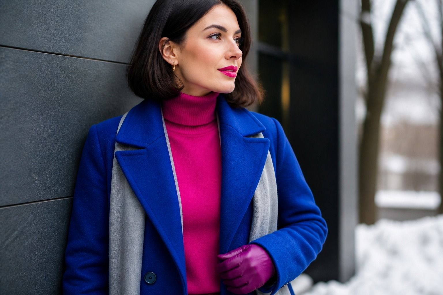
If you have been told you are a winter but the full saturation of the classic palette makes you look pinched, soft winter is probably the corner you belong in. It keeps the cool, clear character of winter while pulling the volume down: the colors stay cool, but they are dusted, grayed, and closer to mid-tone, so the overall effect is composed rather than theatrical. What follows is how I read this palette in practice, where it overlaps with summer, and the specific checks I run before I tell a client to stop reaching for the brightest version of everything.
Why winter can look soft
Every season has a value range, and winter's usual story is high saturation and strong contrast. Soft winter quietly breaks that stereotype. Your natural coloring still has a cool undertone and enough clarity to read as winter, but the contrast between your skin, hair, and eyes is noticeably softer than in cool winter or deep winter. Think of your features as separated by a thin layer of frost: defined, but not screaming at each other.
The palette in practical terms
In practice this shows up as hair that is a cool ash brown or a very dark blonde rather than ink-black, eyes that are gray-blue or muted hazel instead of piercing sapphire, and skin with a cool neutral cast that can look sallow in harsh light. The person usually types herself as "winter but softer" or gets mistaken for a summer in the wrong lighting. The mistake most people make at this stage is to choose between the two labels instead of testing the actual colors, because the difference is not about brightness alone.
A useful check: hold a soft summer's dusty blue next to a classic winter's electric blue. If the dusty version makes you look rested and the electric one makes your jawline harder, you are likely a soft winter with higher clarity than a true soft summer. If both blues look equally wrong, the problem may be your undertone, not your season.
The soft winter color palette is built on colors that are cool, muted, and medium in depth. You will rarely need the darkest black or the most electric cobalt; instead, the palette rewards colors that carry a gray veil while staying unmistakably cool. I describe it to clients as "winter colors with the saturation dial turned down two notches."
Start your shopping with these soft winter colors:
Dusty rose sits at the center of the palette. It looks like the inside of a seashell with a cool undertone, and it works in knits, blouses, and lipstick. Mid-tone blue, especially a muted periwinkle or a grayed navy, does the job that electric blue does for brighter winters. Muted red, closer to a washed cranberry than a fire engine, gives you a color-pop option that stays wearable in daylight. Charcoal replaces black for most casual outfits, and soft black, which reads as a very dark gray, covers the formal occasions where you still want the depth.
One observation from the fitting room: soft winters are the clients who keep saying "that color is almost right but not quite." The almost is usually a matter of temperature. A dusty rose with a whisper of peach will pull yellow from your skin; the same rose with a whisper of blue will work. When you are deciding between two very similar garments, hold them side by side under the same light and look at the undertone rather than the exact shade.
Neutrals between summer and winter
Neutrals are where most soft winter wardrobes quietly fail, because the category straddles two seasons. A soft summer neutral is gray, stone, and dusty pink, while a classic winter neutral is black, white, and navy. Soft winter needs the middle lane: colors that are deep enough to honor your winter side but muted enough to keep your skin from looking chalky.
My default list: charcoal, soft black, grayed navy, mushroom, warm-tinted taupe that still leans cool, and a cool greige. White should be off-white, cream with a gray cast, or a very soft ivory; pure optic white tends to drain the muted tone. Beige is tricky. If it reads yellow against your skin, swap it for a stone color with a blue undertone, which delivers the same lightness without the warmth.
The practical rule I give clients: pair one soft neutral with one muted color and let the muted color carry the outfit's personality. A charcoal sweater with dusty rose trousers reads as soft winter immediately. The same trousers with a bright white top read as a mistake, not because white is banned, but because the two pieces are speaking different saturation levels.
For denim, avoid the icy pale washes that belong to summer and the jet-black pairs that belong to deep winter. A grayed indigo or a mid-tone blue with a hint of fog is the sweet spot. In tailoring, soft black is your evening option; a true black suit can work, but it needs strong makeup to balance it, which most soft winters do not want to carry every day.
Makeup choices that respect the muted tone
Soft winter makeup lives in the same zone as the clothing: cool, blended, and medium-depth. The goal is polish without a hard line. A good starting point is a neutral makeup base: foundation or tinted moisturizer that matches your skin's cool neutral cast, with a satin rather than matte finish, and blush in dusty rose or a muted cool pink placed softly rather than sculpted.
Eyeshadow works best in the grayed mauve, cool taupe, and dusty plum family. Avoid the yellow-toned browns that makeup brands group under "neutral"; they will read as warmth against your skin. A mid-tone gray-brown with a cool cast is the workhorse shade for daytime. For definition, a charcoal or soft brown liner blended with a brush gives more depth than a harsh black line, which can look pasted on with muted coloring.
Lipstick is where soft winter decision-making gets specific. The palette's best lipstick shades are dusty rose, muted berry, cool mauve, and a washed red that keeps a blue undertone. A full-on red that works for bright winter will often overwhelm the face; instead, choose the red's quieter cousin. When I test lipstick on a soft winter, I look at the transition from lip to skin: if the color sits on top instead of melting in, it is too saturated.
One caveat about the current trend toward glossy, almost-transparent lip formulas: they can work, but they should still have a cool undertone. A gloss that reads coral will fight the rest of your palette. If you want the polish without the lipstick commitment, a tinted balm in muted rose is the easiest soft winter option for daily wear.
Avoiding the two common mistakes
The first mistake is treating soft winter as summer. Both palettes are muted, so the temptation is understandable, but the temperature differs. Soft summer colors lean gray and dusty blue; soft winter colors lean gray and cool but keep more depth and clarity. If your palette keeps sliding toward pastel powder blues and lilacs, and your skin looks washed out in them, you have gone too far into summer territory. Your version of a pastel is a dusty color, not a pale one.
The second mistake is the opposite: pushing toward bright or deep winter because "winter should have contrast." I have sat with clients who bought royal blue blazers and black turtlenecks after being typed as winters, then wondered why they looked tired in photos. The soft winter palette does include deep colors, but they need to be grayed versions of those deep colors: soft black, grayed burgundy, muted emerald with a smoky cast. When in doubt, check the color against your natural contrast, not against the season's reputation.
Both mistakes share the same root: comparing yourself to the category instead of the fabric. The palette is a tool, not a uniform. I have met soft winters whose best red is closer to brick, and soft winters whose best gray has a blue cast, and both are correct because the palette is wider than a single capsule.
A three-piece start
If you are rebuilding from scratch, do not buy the whole palette at once. Start with three pieces that test the idea: a charcoal sweater, a dusty rose top, and a muted mid-tone blue scarf or shirt. Wear each of them in daylight with the same jeans and the same natural makeup, and photograph yourself against a plain wall. The pieces that make your skin look smoother and your eyes clearer are your confirmation; the pieces that make you reach for concealer are your warning.
From there, add one neutral and one color at a time, always in the muted-cool family. This slow approach is also kinder to your wardrobe, because almost everything you buy as a soft winter will coordinate with everything else. That is the real gift of the muted winter palette: it looks quiet, but it makes dressing simple.