Olive skin does in color analysis what it does in the makeup aisle: it refuses to behave like the textbooks say. Veins look green, gold and silver both pass, and the same person can look radiant in dusty mauve and jaundiced in mustard. The confusion is real, but it is solvable. This guide explains why olive undertone breaks the usual tests, how to tell a cool olive from a warm olive, and which palettes keep the skin clear instead of gray.
Why olive skin confuses seasonal tests
The standard undertone toolkit assumes skin sits somewhere on a warm-cool line. Olive skin adds a greenish surface tone on top of its actual temperature, so the signals split: veins read greenish, jewelry reads ambiguous, and the white paper test shows a gray cast that fits neither camp. That is not a sign that seasonal analysis does not apply to you. It is a sign that single-signal tests are the wrong instrument, and fabric draping is the right one.
Cool olive vs warm olive in plain terms
There is a habit worth naming: olive skin gets filed under warm seasons by default, especially in older color analysis books that mapped any tan or Mediterranean look to autumn. It is a lazy shortcut, and it produces palettes that sit sallow against cool olive skin. If a warm autumn palette makes you look tired, the problem is the shortcut, not your skin.
Palettes that keep olive skin clear
The confusion gets louder the more products you try, because most foundation and concealer lines are built around pink or golden undertones and simply skip green. That is why people with olive skin develop such strong opinions about specific shades: the right one is rare, and the wrong one is a visible mistake. Seasonal analysis can shortcut that hunt by giving you a whole family of colors to test instead of one product at a time.
The green in olive skin is the surface tone; the temperature underneath is what decides seasons. Cool olive carries a cooler, sometimes slightly pink or mauve undertone under the green and tends to glow in muted blues, plums, and heathered purples. Warm olive carries a golden undertone under the green and stays clear in olive, rust, and softened earth tones. Same green on top, opposite instructions underneath.
A quick home probe: hold a lavender or periwinkle swatch, then a warm olive or rust one, against your jaw in daylight. Cool olive skin looks clearer next to the lavender; warm olive looks livelier next to the rust. If both look fine, you are probably neutral-leaning, and the muted seasons will be your home turf. Either way you now have evidence instead of a guess.
Temperature also shows up in how bronzers and blushes behave. A cool olive usually flatters a mauve or dusty rose blush, while a warm olive responds to peach and terracotta. If your makeup drawer already holds a favorite that just works while others sit unused, check its temperature: it is probably pointing at your undertone more honestly than any quiz.
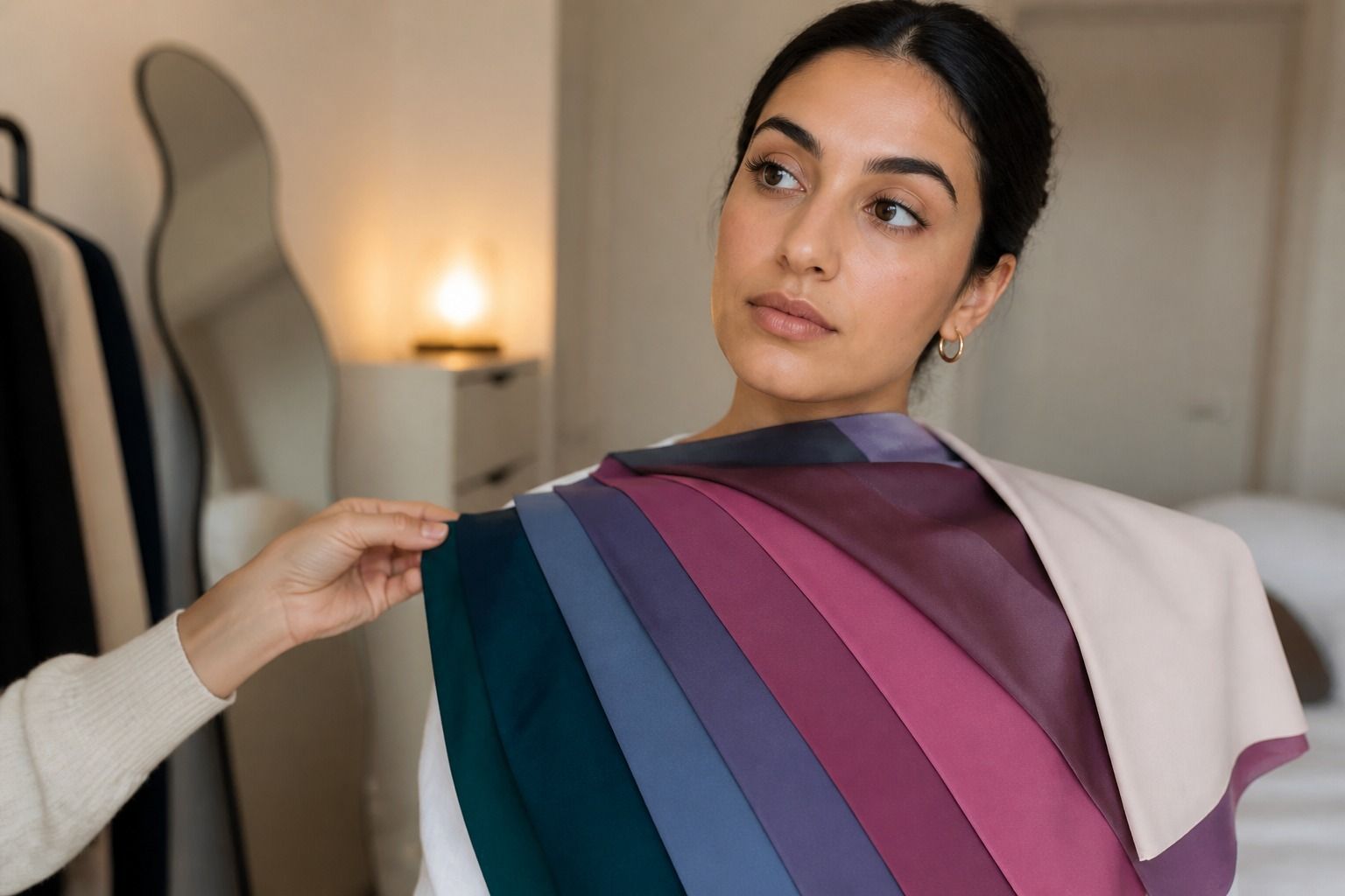
For cool olive skin, the strongest palettes are usually deep summer and cool winter: smoky blues, dusty plums, cool pinks with a bit of gray, and deep teals. For warm olive, warm autumn and parts of true autumn do the work: olive greens, rust, caramel, and softened orange. What the two share is muted saturation with enough depth to keep the face from floating away from the outfit.
Neutral olive often lands in soft summer or soft autumn, and here contrast decides more than temperature. If heathered, grayish tones make you look calm and clear, that is a soft summer signal. If the same tones read dusty and flat, test soft autumn's cream, camel, and moss instead. The olive undertone color palette you end up with should feel like a small collection of certainties, not a rainbow of maybes.
Watch the neutrals in any candidate palette, because they do most of the daily work. Cool olive needs neutral grays and navy that lean blue rather than brown; warm olive needs taupe and camel with a yellow base. A palette can look perfect in its bright accents and still fail in its neutrals, and the neutrals are what you will actually wear to work.
Colors that turn olive skin gray
Some colors reliably do the opposite of flattering, and knowing them beats memorizing a list of good ones. For most olive skin the problem set is overly bright saturation: electric yellow, hot pink, neon green, stark orange. These do not make the skin look tanned; they make it look muddy, because the high chroma fights the green already in the surface tone.
Muddy browns and dirty mustards deserve a second look too. A warm mustard can lift a warm olive, but on a cool olive it pulls every bit of yellow out of the skin and leaves a gray, tired cast. The reverse happens with certain grays: a clear gray-blue is fine, while a warm greige flattens olive skin completely. Test both versions of any color you love before buying, and do it in the light where you actually live, not the store's lighting.
One more check worth running: photograph your outfits in the same daylight over a week. Olive skin shifts less between seasons than other undertones, but it is sensitive to what sits closest to the face, so a top in a wrong tone will register as tiredness even when you slept fine.
Testing seasons with olive undertone
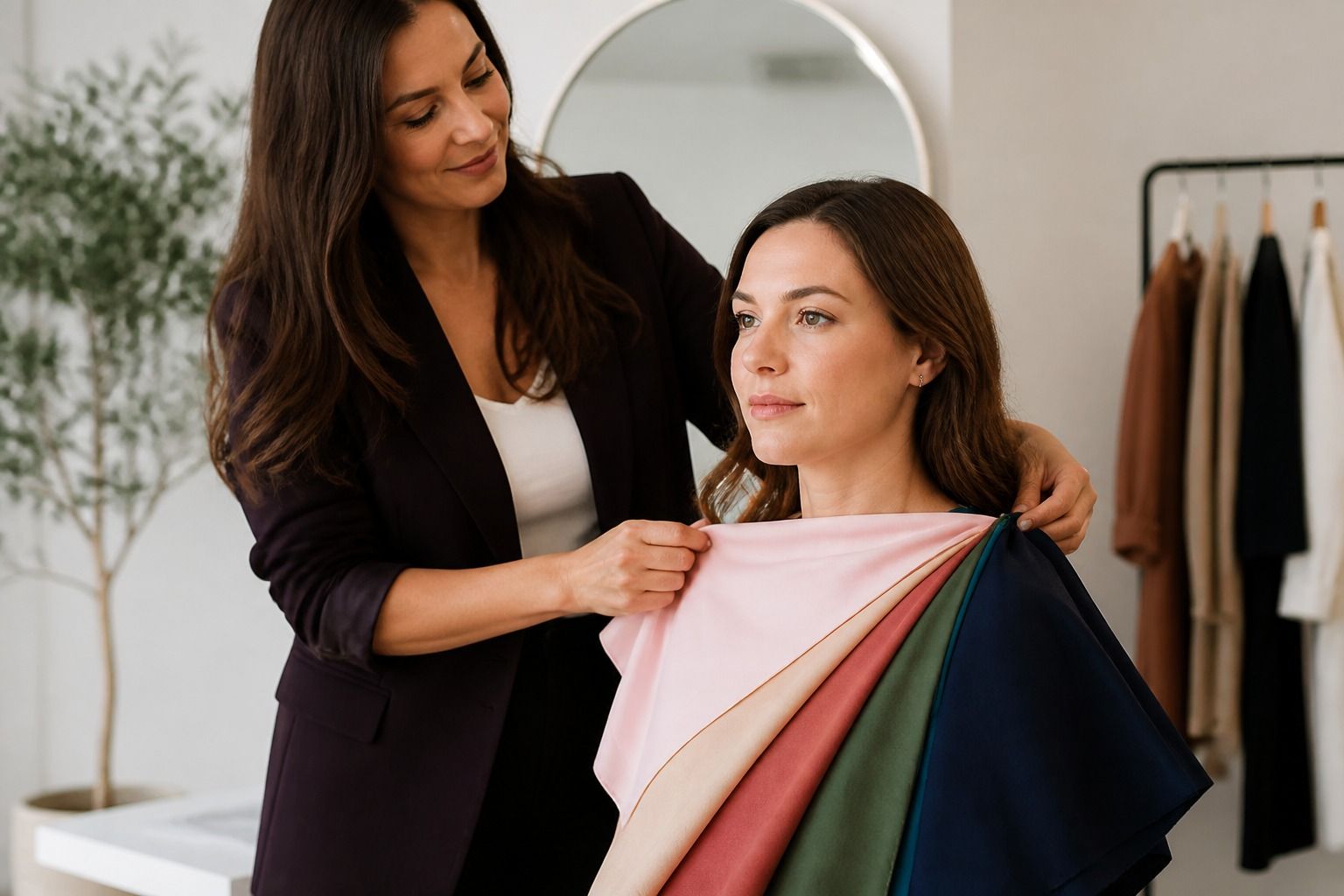
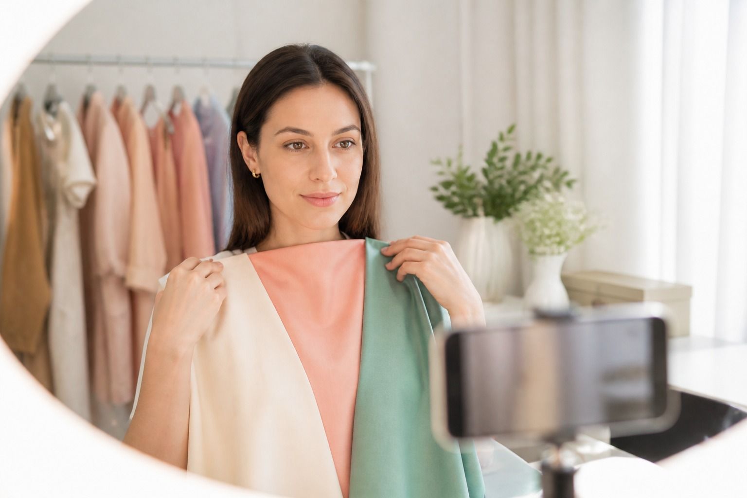
Draping is the only test that reliably works for olive skin, because it shows how whole color families behave instead of asking for one signal. Run it in daylight with no makeup, hair pulled back, and a set of plain swatches: one cool blue, one warm rust, one muted mauve, one bright yellow. Look at what happens under the eyes and around the jaw. A color that clears the skin and softens shadows is working for your season; a color that adds gray is not, no matter what any test predicted.
Expect the results to feel less dramatic than they do for non-olive skin. Olive undertone neutralizes, and many colors will look fine rather than obviously good or bad. That is normal, and it is why a narrow range around your natural depth beats a dramatic palette change. Give each drape a few seconds and move on. The goal is a small set of clear winners, not a perfect ordering of everything you own. Keep the swatches plain and matte; shiny fabric reflects light and flatters everything, which defeats the test.
| Comparison | Cool olive | Warm olive |
|---|---|---|
| Surface tone | Green with pink or mauve cast | Green with golden cast |
| Jewelry | Silver, white metals | Gold, warm metals |
| Clears with | Lavender, plum, dusty blue | Olive, rust, caramel, moss |
| Likely seasons | Deep summer, cool winter | Warm autumn, true autumn |
| Neutral-leaning | Soft summer | Soft autumn |