Light summer is the palette people describe with words like watery, airy, or quiet, and those words are not wrong, but they miss the point. The light summer color palette is built around a low-contrast, cool, gently clear look: hair, eyes, and skin all sit close in depth, and the colors that work mirror that softness instead of fighting it. If you keep reaching for beige and gray because they feel safe, or if pastels look lovely on the hanger but lifeless on you, this guide is about where that goes wrong and how to fix it.
What low contrast means in practice
Low contrast means a small difference in depth between your hair, eyes, and skin. The typical light summer has blonde or light brown hair, fair skin, and light eyes, and the features blend rather than separate. Stand in front of the mirror and squint: if your face reads as one soft unit instead of clear zones, your contrast is low. That single fact explains more about your wardrobe struggles than any color theory, because strong, deep colors will always sit on top of a low-contrast face instead of merging with it.
The gentle cool colors of the palette
The undertone underneath is still cool. Your skin carries blue and pink rather than gold and peach, silver usually suits you better than gold, and your natural flush is pink rather than apricot. But the ordering matters: lightness comes first, coolness second. A medium-depth cool color that flatters a true summer can still overwhelm you, because it breaks the soft unity of the face before you even get to the hue.
One caveat that trips people up constantly: low contrast is not the same as muted. Soft summer is muted, meaning gray is mixed into the colors. Light summer keeps clarity, just at a light depth. If bright clear colors overwhelm you and muddy grayed colors drain you, the direction of the mistake tells you which season you are actually near, and that is a useful clue to hold onto.
The core colors are baby pink, soft aqua, lavender, powder blue, and a clear but light mint. Notice what they share: they are cool, they are light, and they are clear rather than grayed. The intensity sits one careful notch below a pastel that is trying to be neon. These colors look dilute, like watercolor, but they still hold a distinct hue; there is no mud, no dirt, no brown sneaking in.
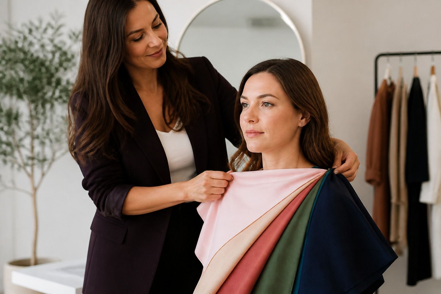
The daylight test is the one I trust most. Take a soft aqua scarf or a lavender top, stand by a window with bare skin and no makeup, and hold it under your chin. If your skin clears and your eyes look rested, the tone is right. If you see the scarf first, the color is too bright for your personal clarity. If your face goes sallow or gray, the color is too warm or too muted, and you should move a step toward cooler and clearer.
Fabric changes these colors more than people expect. The same powder blue reads delicate in silk and lightweight cotton, then turns flat and heavy in thick wool, because light colors need light texture to keep their character. Small prints are your friends: fine florals, tiny stripes, and soft checks all respect the palette. High-contrast graphic prints, big black-and-white shapes, fight the softness and will age you faster than any single color mistake.
Light neutrals that do not wash you out
The light summer neutrals are light gray, blue-gray, soft white, and a clear light navy used sparingly. The whole problem with this palette is the neutral zone: pure white can wash out a low-contrast face, and cream or beige pulls warm and sits wrong. Before you buy another white shirt, hold it next to soft white and then next to your face. If the pure white makes your skin look greyish, the softer version is the one that belongs in your wardrobe.
Silver is the safe metal, and cool gray shoes, bags, and belts keep the frame consistent. Warm tan leather, cognac belts, and gold-heavy jewelry quietly break the effect, even when the outfit itself is right. The sneakiest fix is a touch of depth: one deeper piece, a clear light navy blazer or charcoal trousers, grounds the whole look without destroying the softness. Light summer wardrobes fail not from too much color but from too little structure, so give yourself permission to own the darker neutral that anchors the light.
This is also where hair enters the conversation. Light summers usually look best with ash blonde, cool light brown, or natural tones with a hint of silver; warm honey highlights can pull the whole palette toward spring. If your hair has been colored warm for years, part of what you are testing when you drape colors is really your hair, not your skin. That is not a ban, just a fact to know before you spend money on new clothes.
Makeup for a soft, light effect
Makeup for light summer should look like a better version of your own coloring, not like a mask. Blush in cool pink or rose, applied lightly and blended, should read as your natural flush. Lip gloss in rose, pink, or a soft berry does more for the palette than any opaque lipstick, because the finish stays translucent and the color stays light. The lipstick test that matters: muted rose makes you look polished, while warm brown or orange-red makes you look sallow.
Eyes work best with soft gray, cool taupe, or lavender tones, and brown mascara usually beats harsh black, which can close off the face. Keep eyeliner thin and smudged rather than crisp, and skip the heavy contour entirely; low contrast means the shadows are soft, so makeup should not invent hard ones. A subtle silver-pink highlighter on the cheekbones catches the light the way your skin naturally does.
The one thing I tell every light summer client to avoid is the bronzer reflex. Warm bronzer, applied the way tutorials show, turns a cool light face muddy within hours. If you want warmth, choose a cool rose blush or a touch of powder pink, not a tan in a pan. When in doubt, do your makeup one step lighter than your instinct; the effect should be that you look rested, not made up.
When light summer borders on another season
Light summer has three close neighbors, and knowing which one you drift toward is more useful than insisting on a single label. True summer has more contrast and can handle medium depth. Soft summer is muted rather than light. Light spring is warm, which is the whole game changer: it shares the lightness but not the undertone. The quick home test is three fabrics in daylight: soft aqua, muted mauve, and peach. Aqua and lavender clearing your skin point to light summer; muted mauve working better points to soft summer; peach warming you up points to light spring.
| Signal | Light summer | Soft summer | Light spring |
|---|---|---|---|
| Undertone | Cool | Cool-neutral | Warm |
| Primary feature | Lightness | Mutedness | Warmth with lightness |
| Best test colors | Soft aqua, lavender | Muted mauve, dusty blue | Peach, warm aqua |
| Lip color | Rose gloss | Rose-mauve | Peachy pink |
| Risk color | Beige and taupe | Bright clear pink | Grayed blue |
Most people land somewhere between two rows, and that is fine. The practical rule is to pick one dominant season and borrow one or two colors from the neighbor when a specific situation calls for them, then keep the rest of the outfit firmly inside your home palette. Recheck the drape after a hair color change or a serious tan, because both shift the balance. The light summer color palette is forgiving once you understand it: it asks for softness, coolness, and a little structure, and it gives back a face that looks clear instead of erased.