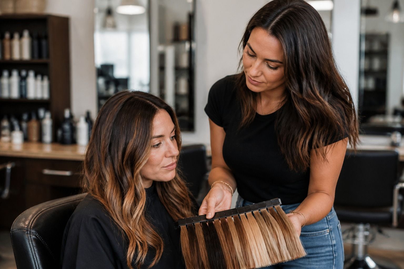
Every few months someone books a salon appointment with a season name and a screenshot, and the color comes out technically beautiful but somehow wrong against the face. The usual cause is not the dye or the stylist. It is a missing decision about depth and contrast, which matter more than any single shade. This guide walks through how to read your season into a hair color: depth first, temperature second, dimension last, and then how to turn all of it into directions a colorist can follow.
Why the same hair color fits some seasons
Hair color works when it keeps the face in focus, and the same brown, blonde, or red can do that for one season and drain another completely. A deep winter can wear near-black and still look awake; a soft summer wearing the same near-black usually ends up with shadows under the eyes. The difference is not the quality of the color but its relationship to your natural depth and contrast.
Reading depth before temperature
Contrast is the gap between your hair, skin, and eyes. High-contrast people, which covers most winters and some summers, hold strong color well. Low-contrast people read better when the hair stays close to natural depth. The rule I keep returning to: your best hair color usually lives within one or two steps of your natural depth, even when you change temperature or add dimension. Breaking that rule is possible, but it should be a decision, not an accident.
A quick way to see your contrast level: squint at a mirror until your features blur into shapes. If your hair, skin, and eyes read as distinct blocks, you have strong contrast; if they melt into one tone, you have soft contrast. Seasonal color analysis asks you to match hair to that softness, not to the shade you wish you had. This is the quiet reason two sisters with the same base brown can wear completely different colors successfully.
Depth is how light or dark the color is, and it deserves to be settled before anyone mentions warmth. Ask yourself which part of your natural range feels right: lighter than now, darker, or the same level with a different tone. Lightening more than two levels without a clear plan often breaks the palette, especially for muted seasons, because the hair starts competing with the skin instead of framing it.
Test depth the way you would test any color: compare. Hold a scarf near your natural level, then one lighter and one darker, in daylight, with no makeup. Watch what happens around your eyes. If the darker swatch adds shadow, your depth ceiling is lower than you thought. If the lighter one washes you out, that level needs a softer treatment, like highlights instead of an all-over lift. Two scarves and a mirror settle more arguments than any hair color chart.
Depth also controls how often you visit the salon. A dramatic lift grows out as a hard line and pulls you back every four to six weeks; a depth close to your natural root grows out gracefully and can coast for months. If your routine or budget wants low maintenance, let that decide the depth before you fall for a lighter shade. Maintenance is a real constraint in hair color analysis, and pretending otherwise is how people end up re-dyeing every month.
Choosing a cool or warm direction
With depth settled, temperature is the next decision, and it should follow your undertone rather than a trend. Cool seasons, which means summer and winter, usually stay flattered by ash, beige, mauve, and smoky tones. Warm seasons, spring and autumn, read best in golden, caramel, copper, and honey. The failure mode is a cool season reaching for a warm caramel because it brightens the face. It does brighten for a few weeks, and then the roots grow in and the whole result reads brassy against cool skin.
A useful check is your natural hair in childhood photos. Color memory is warm-biased, so photos from before dye entered the picture give a steadier read. If childhood hair leans ash and current photos look golden, the warmth is probably dye and lighting doing the talking, not your palette. For hair color analysis, that single correction saves more salon visits than any app.
Highlights and dimension within the palette
Dimension is where hair color gets interesting, because a season palette is a range, not a single point. A soft summer can wear mousy blonde, dusty brown, or a blend of both through baby lights; a cool winter can carry deep espresso with subtle cool highlights. The trick is keeping every tone in the same temperature family. One warm caramel streak inside a cool palette is enough to pull the whole look off track, and nobody notices until the next day in daylight.
For a change without a commitment, start with face-framing highlights in the new direction. That keeps your natural depth in most of the hair, shows how the tone behaves against your skin, and leaves a gentler regrowth line. I have watched more clients regret a full transformation than a gradual one, and the gradual one is easier to steer when the season turns out different from the guess.
Taking the palette into a salon appointment
Salon conversations fail when they use dye names instead of decisions. 'I want caramel' tells a colorist nothing about your season. 'Stay at my natural depth, go cool, add face-framing highlights' gives them a working direction. Bring a few palette images, but pick ones showing the full range of your season, not a single celebrity photo, which usually arrives with heavy color grading on top. A palette page from your season beats a hundred glamour shots, because it shows the range your face can actually carry.
Virtual hair color try on apps help if used honestly. They are not color analysis: they cannot read your undertone or skin texture, and their rendering shifts with your phone camera. Use them to test depth and rough temperature before the appointment, screenshot the two or three looks that felt right, and hand those over as conversation starters rather than orders. The clearest direction in the world still needs a colorist who listens, so book someone who asks about your season before reaching for a tube.
| Season | Depth guidance | Temperature direction | Dimension idea |
|---|---|---|---|
| Soft summer | Stay close to natural, avoid very dark | Cool ash, beige, dusty tones | Subtle baby lights, soft money piece |
| Cool summer | Medium range, no more than two steps from natural | Ash, cool taupe, mauve tones | Face-framing highlights |
| Cool winter | Deep range suits high contrast | Espresso, cool black, icy tones | Subtle cool highlights for depth |
| Warm autumn | Medium to deep, warm base | Caramel, copper, honey tones | Balayage in the warm family |