Deep winter is the darkest branch of the winter family, and it is also the most misunderstood. People hear "deep winter" and picture a person who can wear anything black, but the real palette is more specific than that: it is built on deep colors with a cool undertone and enough contrast to anchor the face, not crush it. In consultations I see deep winters who have been told to wear only black and white, and deep winters who have drifted into deep autumn's browns by accident. Both mistakes come from the same gap: knowing the family without knowing the structure. This guide covers the structure, the neutrals, the pairings, and the exact point where deep winter splits from deep autumn.
The structure of the deep winter palette
Deep winter sits at the intersection of three qualities: deep, cool, and clear. The colors are dark, but dark is not enough on its own; a deep brown can be dark and still belong to autumn. What makes a color deep winter is that it is dark and cool, with enough saturation to stay vivid at low depths. Think of a black that glows faintly blue, a burgundy that still reads as wine rather than mud, an emerald that holds its green even in dim light.
Deep neutrals that stay cool
Contrast is the second pillar. Deep winters have naturally high contrast between skin, hair, and eyes: dark hair with lighter eyes, or dark hair with very fair skin, or simply very dark features all around. The palette mirrors that contrast by pairing a deep color with a lighter accent rather than stacking dark on dark. This is the detail most people miss. A deep winter in head-to-toe black looks severe not because black is wrong, but because the outfit erased the contrast that is the season's whole point.
The practical profile of a deep winter: dark hair that may be natural black, very dark brown, or a cool-toned dark shade; eyes that are dark brown, dark hazel, or a deep cool green-blue; and skin that can range from porcelain with a blue undertone to deep olive-cool. In deep winter color analysis, the uniting thread is depth plus coolness, not any single feature. If you have been told you are a winter but the bright electric colors of bright winter overwhelm you, depth is likely your lane.
Black is the deep winter signature, and unlike in most other seasons, it genuinely works here. But even black has gradations. The most flattering black for deep winter is not a matte flat black but a black with a cool sheen, like a black that picks up blue light in sunlight. If a pure matte black drains you, swap in a very dark charcoal or a black with a blue undertone, which carries the same depth without the harshness.
White works as the contrast partner, but the deep winter white is a clear, crisp white, not a cream. Cream and ivory carry warmth, and on a deep winter they can read as a yellowish mismatch next to the cool depth of the skin. If you feel washed out in pure white, choose a cool off-white or a soft silver-white and use it in smaller amounts: a collar, a top layer, a blouse under a deep blazer.
Navy is the workhorse deep neutral. A true deep navy, dark enough to look black at a glance but visibly blue in daylight, does everything black does with more softness. For professional settings, a deep navy suit is usually the deep winter's best answer to the all-black suit, because it keeps the depth and adds a cool dimension. Gray should be chosen with care: the deep winter grays are the darker, cooler end of the scale, from charcoal to a gray with a blue cast. Mid-tone warm grays belong to autumn and will make your skin look muddy.
A quick caveat about brown: deep winter can wear some browns, but they are the coolest browns, like a dark espresso with a gray undertone or a cool cocoa. The warm caramels, rusts, and golden browns that flatter deep autumn will add a yellow veil to your complexion. When in doubt, choose the brown that looks more like coffee with no cream than like chocolate with caramel.
Color pairings that keep the contrast
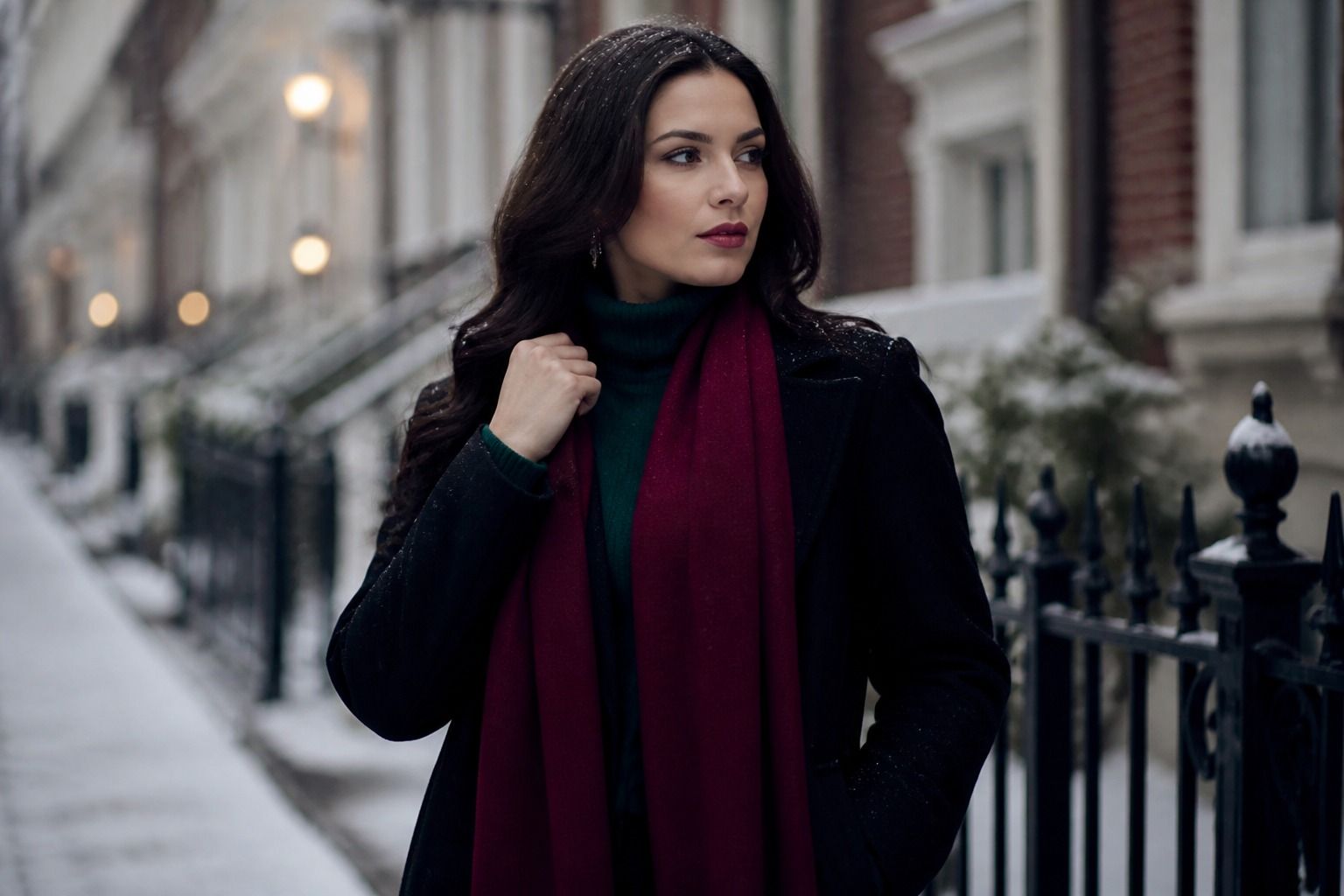
The deep winter palette's colors work best in pairings that respect the natural contrast of your features. Burgundy, emerald, royal blue, and plum are the core colors, and each one has a specific partner that makes it sing. Burgundy pairs with black for evening and with a soft white or light gray for daytime; the lighter partner prevents the burgundy from sinking your whole face. Emerald works with deep navy or with black, and it also pairs surprisingly well with a cool silver accessory that echoes the green's cool undertone.
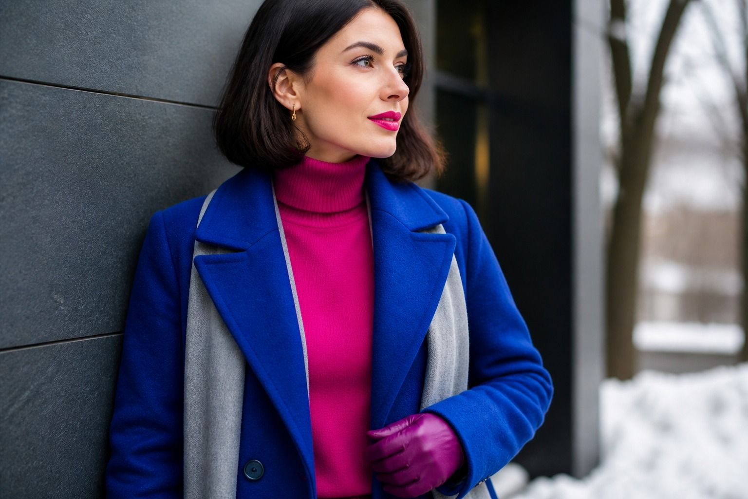
Royal blue is the color that surprises most deep winters, because they usually avoid it as "too bright." In the deep winter palette, royal blue is not pastel or electric; it is a deep, saturated royal blue, close to a sapphire with a navy edge. Worn with black trousers or a charcoal skirt, it delivers the contrast the season needs while staying office-appropriate. If a royal blue garment makes you look tired, check the saturation: a royal blue with a gray or navy cast is deep winter; a royal blue with a white or electric cast leans bright winter.
Plum is the palette's quiet weapon, the color that looks ordinary in the store and remarkable on the body. It works in knitwear, blouses, and outerwear, and it is the safest choice when you want a deep winter color that is not black. For pattern lovers, the deep winter rules are simple: keep patterns cool-toned, keep the background deep, and let one color carry the contrast. A burgundy and white geometric print, an emerald and black houndstooth, a royal blue and silver stripe, these all read as deep winter. A print with orange or mustard in it will read as autumn regardless of the background.
Denim is worth a separate note because it is such a frequent wardrobe base. Deep winter denim should be dark: indigo, dark blue, or black-blue. Light washes and acid washes erase the depth your coloring needs and work better for summer or spring types. If you love light denim, wear it as a jacket with a deep top underneath, so the face is still framed by a deep color.
Lipstick and makeup for deep winter
Deep winter lipstick is one of the easiest makeup decisions in the whole system, because the palette can carry strong color. The best shades are the deep, cool ones: a true deep red with a blue undertone, burgundy, wine, plum, and a raspberry that stays cool. A classic red that flatters deep winter is the red that looks almost black in the tube and releases its color on the lips. If a red pulls orange on you, it is the wrong red for your undertone, not the wrong style.
The one deep winter lipstick rule I repeat constantly: dark does not mean muddy. A plum that is deep but clear makes the skin look luminous; a plum with too much brown in it makes the whole face look tired. When testing lipstick, apply it to the full lip, step into daylight, and check whether the color brightens your eyes or competes with them. Deep winter can also wear a lighter neutral lip, a cool pink or a muted rose, but the signature look is the deep stain.
For the rest of the face, keep the makeup cool and structured. Foundation should have a cool or neutral-cool undertone; blush works best in a cool rose or a berry that is not too bright; eyeshadow in cool taupe, gray, deep plum, or a soft black-brown creates the definition the season can carry. Eyeliner is where deep winter can go bold: a black or deep navy liner works, and a berry or burgundy liner is an understated way to echo the palette. The overall rule is to let one feature carry the color and keep the rest clean, which mirrors the contrast principle in clothing.
Where deep winter and deep autumn split
The boundary between deep winter and deep autumn is the most common place for a misdiagnosis, because both seasons wear dark colors and both can look good in a certain depth range. The difference is temperature, and it shows in the brown-to-black gradient. Deep autumn's dark colors lean warm: espresso, mahogany, olive-brown, warm burgundy, and a brown-black. Deep winter's dark colors lean cool: true black, blue-black, cool burgundy, emerald, and plum. If you hold a dark espresso scarf and a black scarf under your chin, the one that smooths your skin is your side of the line.
Skin undertone usually settles it. Deep autumn skin carries a warm or golden undertone, even at the deepest depths; deep winter skin carries a cool or neutral-cool undertone. Check the veins at your wrist in daylight: a blue or purple cast points to deep winter, a green cast points to deep autumn. If your veins look somewhere in between, check your eyes and hair for the same temperature. Deep autumn often has warm-flecked eyes and hair with a reddish-gold glint, while deep winter eyes are cool and hair reads ashier or bluer in light.
There is also a practical wardrobe signal. If your best black-based outfits look effortlessly right and your brown-based outfits look "almost right," you are deep winter. If the reverse is true, if warm browns and olive make you look alive and black makes you look severe, you are deep autumn. Many people live close to this line, and that is fine; the shared colors of the two palettes, like cool burgundy and deep forest green, will carry you through the ambiguous zone.
One myth deserves a direct answer: black does not suit everyone, and it does not automatically suit every deep winter either. It suits the deep winter who pairs it with contrast and supports it with cool makeup. If black alone makes you look tired, wear deep navy or blue-black instead, and keep the black for the pieces that need it. The deep winter color palette is a system of relationships, and the relationship between depth and coolness matters more than any single shade.
Start with what you already own. Pull out your darkest pieces, check their undertone in daylight, and keep the ones that are cool and deep. Add one royal blue, one burgundy, and one emerald piece over the next season, and watch how much more defined your face looks next to them. That is the whole promise of deep winter: contrast you can rely on, without the harshness.