Deep summer is the type that makes people hesitate. The coloring is cool like a summer but deep like a winter, and neither classic palette fits cleanly, so the wardrobe drifts toward black and bright red by default. The deep summer color palette lives in the shaded middle: colors with enough depth to match dark hair, enough coolness to match the skin, and enough grey to stay soft.
Where deep summer sits in the 16-season system
Start with the family. Deep summer keeps the summer temperature, cool and soft, but trades the usual lightness for real depth. The typical features: dark brown or ashy dark hair, cool or neutral-cool skin, eyes that can be deep brown, hazel, or grey-blue, and overall contrast that is medium-high but not dramatic.
The colors that carry the palette
People often land here after being typed as deep winter or soft summer. The difference is chroma. Deep winter is clear, its colors saturated and sharp. Deep summer is muted, same depth but with grey mixed in. Soft summer is muted too, but it lacks the depth, so its palette washes out against dark hair.
Once you see the axis, the name stops being confusing. Deep summer asks for color that is dark enough to be seen and soft enough not to shout.
Most people find this type by elimination. They know they are cool, they know they are not a winter, and the summer palettes they tried all looked washed out. That sequence, cool but not clear, deep but not bright, is the fingerprint of deep summer, and it also explains why the palette is usually the last one people try.
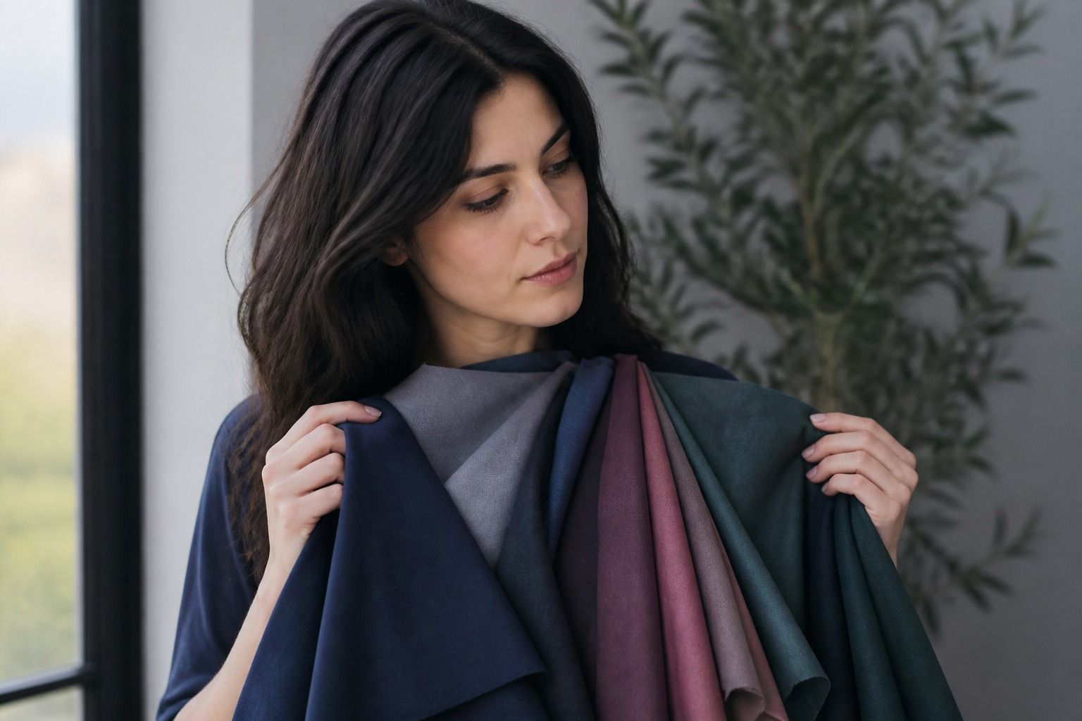
The core deep summer colors are cool and shaded: plum, berry, teal, dusty blue, deep burgundy, and muted pine. These are summer colors with the lights turned down, or winter colors with grey added, depending on how you look at them.
Plum is the signature. Not grape, not fuchsia: a plum that sits between muted and deep, dark enough to read as a color rather than a neutral. Berry follows closely, especially in lipstick and knitwear. Teal works when it is dusty rather than electric, and dusty blue becomes the everyday alternative to the pastel blues that pale summers wear.
The pattern to feel for: every winning shade holds its depth while staying slightly greyed. If a color looks like it belongs in a fluorescent winter palette, it is probably too clear; if it looks pastel, it is probably too light.
| Type | Temperature | Depth | Chroma | Works | Reads wrong |
|---|---|---|---|---|---|
| Deep summer | Cool | Deep | Muted | Plum, dusty teal, charcoal | Neon pink, pure black, candy pastels |
| Soft summer | Cool | Light to medium | Very muted | Powder blue, mauve, light grey | Deep charcoal, saturated berry |
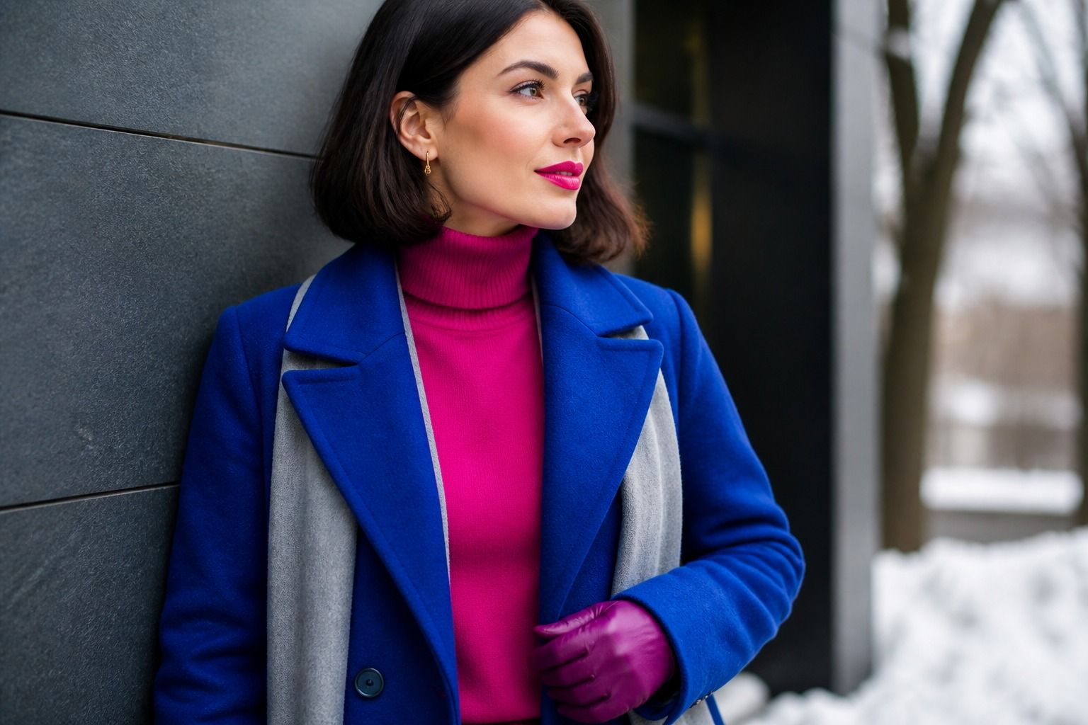
| Deep winter | Cool | Very deep | Clear | Royal blue, true black, bright crimson | Dusty mauve, greyed plum |
When in doubt, compare two versions of the same color: a dusty plum next to a bright berry will show you which side your skin wants.
Prints deserve their own mention. A deep summer print should mix the muted and the deep within the same temperature, like dusty blue with a plum accent, rather than pairing pastel with black, which recreates the contrast problem in miniature. If a pattern makes your face recede, the print is carrying more depth than your coloring can hold.
Neutrals that do not kill the effect
Neutrals decide whether the palette works daily, because they cover most of the outfit. Charcoal and deep navy replace black, which tends to sit on top of muted skin like a sticker. Cool greys, mushroom tones with a blue cast, and deep plum-brown read as the deep summer version of beige.
White needs the same treatment. Pure white is stark against muted coloring; a soft cool off-white with a hint of grey holds the depth better. Cream and camel lean warm and can drag the whole look into autumn territory, so treat them as accents at most.
Denim is the easy win. Medium-dark indigo carries the depth and coolness without effort, while light stonewash washes the face out and black jeans recreate the black problem. A deep summer wardrobe can be built on navy, charcoal, plum-brown, and indigo and never feel boring, because the palette's colors carry the interest.
Makeup that stays soft instead of harsh
Makeup follows the same rule as clothes: depth without brightness. Lipstick in muted berry, plum, or rosewood looks natural; fuchsia and bright raspberry jump off the face, and brown-mauve turns sallow because it pulls warm. A berry stain, blotted, reads softer than a fully opaque raspberry, so texture helps too.
Eyeshadow works in taupe, dusty mauve, soft charcoal, and muted plum. Frosty pale shadows fight the depth and make dark hair look heavy; black liner does the same. A deep grey or muted teal liner keeps definition without the harshness.
Blush in dusty rose or muted pink keeps the face cohesive. The overall test is simple: if the makeup completes the outfit rather than starting an argument with it, the depth and chroma are right. Deep summer color analysis usually comes down to this exact balance.
Nails follow the same logic. A dark plum or muted teal polish extends the palette without pulling the eye; candy pinks and bright corals fight it. When the whole look shares one temperature and one grey level, the outfit reads as intentional rather than random.
How to test whether a shade is deep enough
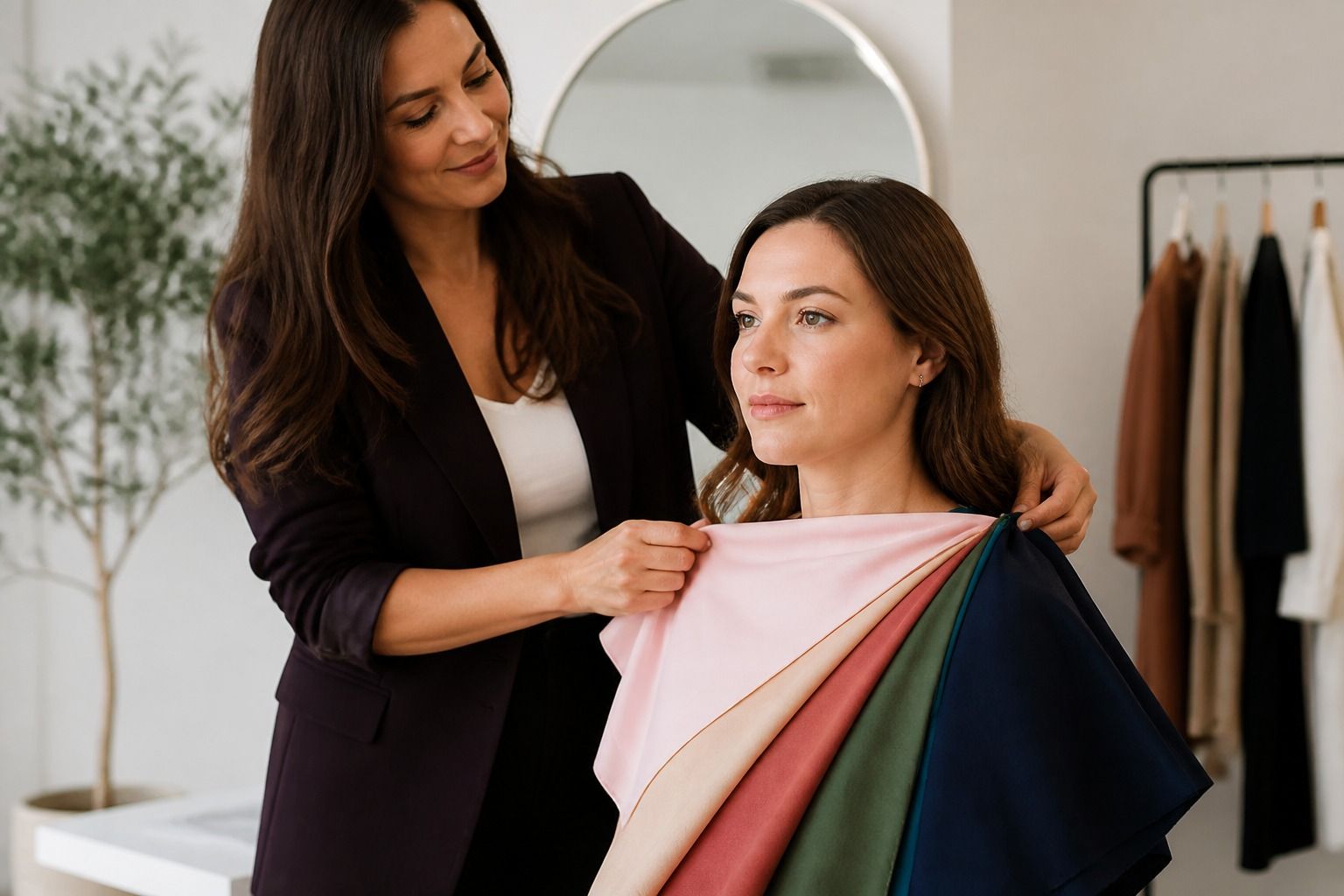
Testing takes two swatches and a window. Hold a color you suspect is too light next to a color you suspect is too deep, and watch the skin react. If the lighter one makes shadows appear around the mouth, it is too light; if the deeper one makes the skin look grey, it is too muted or too warm.
The half-step rule saves most people: when a summer color looks pastel on you, take it half a step deeper; when a winter color looks glaring, take it half a step greyer. Between those two moves sits the deep summer palette, and most of the good colors are within a step of what you already own.
One caveat about the mirror: test in daylight, not in store lighting. The muted tones of a deep summer palette look dull under warm bulbs and suddenly work by the window, which is why this palette gets returned more than it should.
Final check: if the color makes you look rested and your features stay the subject, it belongs in the palette. That is the whole test, and it applies to clothes, lipstick, and the next shopping trip alike.